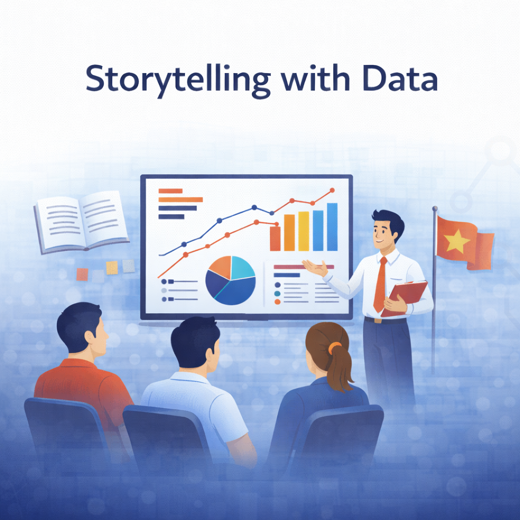
Learn how to communicate insights effectively using charts, dashboards, and data storytelling principles.
Course Info
- 🎯 Level: Beginner / Intermediate
- ⏱ Duration: 15 Hours
- 🛠 Tools: Excel, Power Bi
- 📄 Certificate: Yes (Verified)
- $ Price: 90$
Who is this course for?
- Data analysts and BI developers
- Business professionals presenting data to stakeholders
- Students who struggle with explaining insights
- Anyone who wants to turn data into clear stories
What you will learn
- Principles of effective data storytelling
- Choosing the right chart for the right message
- Designing clear and impactful dashboards
- Structuring insights for decision-makers
- Avoiding common data visualization mistakes
Course Outline
- Introduction to Data Storytelling
- Understanding Your Audience
- Chart Selection & Design Principles
- Building Insight-Driven Dashboards
- Presenting Data with Confidence
- Real-World Storytelling Examples